 |
 |
 |
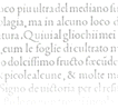
"In February 1496, Aldus published a rather insignificant essay by the Italian scholar Pietro Bembo. The type used for the text became instantly popular. So famous did it become that it influenced typeface design for generations. Posterity has come to regard the Bembo type as Aldus's and Griffo's masterpiece." Allan Haley, Typographic Milestones Van Nostrand Reinhold 1992 |
|
Some sources cite the publication of Cardinal Bembo's De Aetna as 1493 or 1495. And in fact, the design continued to evolve until the 1499 publishing of the spectacular Hypnerotomachia Poliphili. Let's not split hairs. Let's celebrate 500 years of Bembo! In the mid fifteenth century printing quickly spread to Italy from Germany, and by the 1470's Venice had became the center of the printing industry, home to over 100 printing companies. Pioneers such as Erhard Ratdolt and Nicolas Jenson had already begun working on adapting the roman alphabet for metal type by the time Aldus Manutius established his press in 1494, with the intention of publishing all the Greek classics. Aldus Manutius (1450 -1515) was a printer, entrepreneur, a great ego, and publisher of over 1200 titles. Among the many contributions of Aldus was the popularization of small, portable books. His expensive beautiful books were far from today's paperbacks, mind you. |
|
| One of the many great talents working for Aldus was Francesco Griffo, a gifted type designer. Griffo created many innovative type designs that are still admired for their beauty and readability. Their collaboration broke up over a copyright dispute, primarily over the ownership of the cursive type face that Griffo developed under the direction of Aldus. Although Aldus even had a papal decree to protect this style of alphabet, it was as difficult then as it is now to protect a typeface design. The alphabet was widely copied, and the style is known as italic, after its country of origin. Gutenberg, followed by Aldus and his peers spawned the communications industry. The speed and distance at which an idea could travel increased exponentially in a few short years. Half a millenium later the speed at which ideas and information propogates is once again multiplying before our eyes. Today's Internet and World Wide Web bring to increasing millions of people the ability to publish instantly to a world-wide audience. While we revel in this exciting explosion of communications and technology, it also represents a bleak moment in typography. The HTML-formatted words you are reading right now are nowhere near as readable as those from a page from De Aetna. In time, computer software and displays will improve, and the typographic excellence of Hypnerotomachia Poliphili may be possible on screen. (Update 12.17.01: cascading stylesheets and widely available free typefaces developed specifically for the web like Georgia and Verdana have helped a lot in the last few years, but we still have a long way to go.) |
Selected LinksIN AEDIBVS ALDI The Legacy of Aldus Manutius and His Press Brigham Young University BYU boasts one of the best collections of Aldine books in the world. They offer an excellent web site, with text excerpts from a recent catalog and JPEG samples from many of the 500+ Aldine books in their collection, showing the bindings and inside pages. Visit the IN AEDIBVS ALDI home page. The Colonna Project Information Media Design Group, Rutgers University This site is dedicated to the Aldus and Griffo landmark edition of Francesco Colonna's Hypnerotomachia Poliphili. Their research is brimming with content and context. Surprisingly, the best online images of this book are found elsewhere. Ironically, Aldus, who put his dolphin and anchor seal on almost everything, is not actually identified in the book as the printer (possibly because of the erotic nature of some of the woodcuts) of what many consider one of his greatest masterpiece. No longer online. Typographic Exemplars The Cary Collection The Cary Collection is a library on printing history located at the Rochester Institute of Technology in Rochester, N.Y. Their web site contains an entry on Aldus and the Hypnerotomachia Poliphili that includes the best samples I have found on-line. See the Aldus entry at the Cary Collection (excellent JPEG samples) Visit the home page of the Cary Collection Selected BibliographyAn Atlas of Typeforms The Best of Fine Print Magazine on Type and Typography (1977-1988), 1989 Bedford Arts The note to the 1988 edition states "An Atlas of Typeforms ... was first published in 1968, and is a unique record of five centuries of metal type." Fine Print on Type James Sutton and Alan Bartram, 1969, reprinted 1988 by Wordsworth Editions Ltd This tremendous grab-bag of essays and explorations is a delight to return to. Of most help to the construction of this page was an essay by John Dreyfus, "The Dante Types," a discussion of a 1960s type face heavily based on the work of Francesco Griffo. Typographic Milestones Allan Haley, 1992 Van Nostrand Reinhold This book features essays and biographical information on eighteen major contributors to the development of type and typography, from Gutenberg to Baskerville to Gill. A wealth of insights! Oddly, there is almost no mention of the 19th century, an era that saw the introduction of both slab and sans serif type styles. |
This page written and designed by Kevin Steele, February 1996
Rebuilt 12.17.01