|
|
|
As printmaker in the 1980’s, I learned to appreciate the
unique strengths of hi-res versus low-res media. It’s perhaps counterintuitive, but
low-res media often has the greatest emotional impact. Think
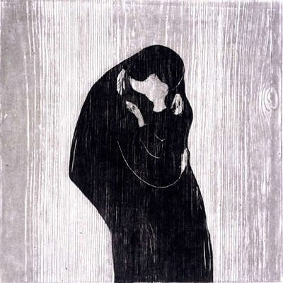
of Edvard Munch’s wood
block prints.

Screen design in 1991 had limitations analogous to
woodblock printing. Kevin’s experience was making video,
another low-res medium, where the same lessons apply. Low-res visual media
have a will of their own, and will frustrate any artist who
tries to impose a high-res vision. The artist in a low-res medium
is never more than a collaborator; the medium always
makes
its presence felt, through wood grain, or NTSC
interlacing, or chunky
8 bit pixels.
Boy we had it tough. Why is this still interesting? Well, there’s always a new low-res medium; today it’s mobile phone screens. More importantly though, low-res is worth exploring in it own right, because:
Low-res requires abstraction, and abstraction requires understanding.
Abstraction amplifies meaning by cutting away noise and leaving only essentials.
Hi-res lets us get away with not abstracting.
Understanding low-res makes our hi-res work better.
Of course, some
lessons ought to be forgotten. For example, who made the
rule that you should never use serifs for system type? OK we
did, but that’s beside the point. The point is it stopped
being true several years ago. Just as good paper made Bodoni
possible, high-res (and CCS) are making sensitive on-screen
typography possible. Georgia, set 14/18 is quite readable, in my opinion. The
serifs don’t turn to mush; they enhance, not impede
readability. (Windows users, please tell me you have font
smoothing turned on).