Making The Mackerel Stack 1.0
We had desktop graphics services to sell. Our target market had Macs for graphics,
but needed experienced Mac help. While a brochure would be too expensive to print,
we could afford disks, a box at a time.
As the summer of 1989 ended, we committed to creating a HyperCard stack to market our services.
Our stack needed to showcase both
our technical abilities and our design sensitivity. And we learned from Emigre that our stack
needed something interesting that was not just about us.
The title was a no-brainer, and once we had the name,
the basic structure of the stack just fell into place. Soon we had a design for a main menu.

When we chose the name of our company, we knew the fish looked cool and the word was fun to say.
When we put ‘mackerel’ with ‘stack’, we were swimming in ideas. 
The stack would be divided into three main areas: one area would cover our services; the second would cover who we are;
and the third section would be just for fun. This design worked for us so well that we kept the layout for every version of our stack.
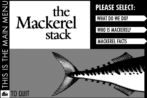
For the demonstration of our capabilities, we gathered as much portfolio work as we could.
Most work was presented in slide shows, that the user had no control over, synced to music made with HyperTalk.
We were just starting up the hypermedia learning curve.

Because of the novelty factor of interactive media we could get away with some mystery.
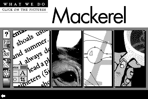
The small icons on the left represented software we were proficient with. Clicking on them opened a text box with more info. The large graphics linked to slide shows
of example work.
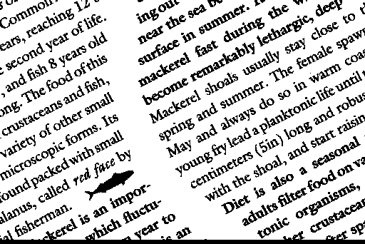
 We tried to impress with stunt typesetting, like this wavy gutter.
Mouse over or down to see other screens.
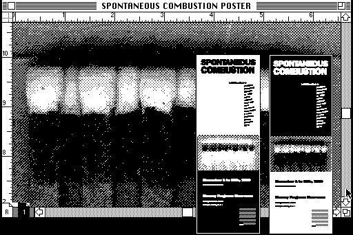
 For a low budget project for a local art collective called Spontaneous Combustion, we created matchbooks and large posters from blueprints.
The posters were designed to be printed both positive and negative on large blueprint paper. The match image was produced
with a matchbook on our scanner.
This was shown as one image in a slide sequence, and probably communicated much less than we wished.
Since we had committed to including fun facts about mackerel, the fish, we set out to learn about mackerel,
and other scombrids.

One click into the Mackerel Facts and we get a menu much like the main menu; Fun Fish Facts was a stack within a stack.
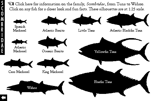
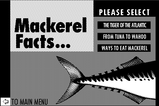 The scombrid menu was one of the best things in the original stack. We were sure we were onto something good when we were
able to combine information with navigation.
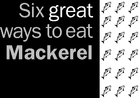
 Somehow we were convinced that including a menu of recipes was very funny. It was only with later versions that we
actually tested the recipes. (Mouse over for a recipe.)
We had a blast injecting jokes
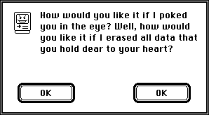
 If the user clicked a fish eye anywhere
in the stack, an alarm sounded and then the user was confronted with a modal dialog box that featured dire consequences,
two ‘okay’ buttons and no ‘cancel’ button. Every version of the stack contained a variation on this joke,
which became more elaborate with subsequent versions.
— detours about baseball

 — and other non sequiturs

 into the stack. Making an animated type intro was great fun.
 This screen was the beginning of a torturous 40 second sequence of animated type, accompanied
by a
 tune sequence of sounds that I imagined evoked ‘Mutual of Omaha’s Wild Kingdom’.
 Don’t try this at home. The overlong animated intro is a bad idea still common in beginner multimedia.
We were sure glad to get that mistake out of the way.
And then we were done.
Unveiling The Mackerel Stack 1.0
As proud creators we started to show the finished stack to friends and colleagues. People were excited
and supportive, and pointed out all the good things about it.
They did not need to say out loud what was wrong with it, however.
We watched where people were confused and made mental notes. We started to get impatient, ourselves, showing
some sequences. And we started to cringe during much of the music.
All of the tunes in the stack where produced with the only two ‘instruments’ that were built in to HyperCard.
After hearing the stack too many
times it dawned on me what it sounded like:
boing tink boing boing boing tink tink boing tink tink boing....
Soon after, I learned how easy it could be to create and install different sounds in a stack — if only we had a MacRecorder.
I’d have slapped my forehead and said D’oh! but
didn’t know the word, yet.

Warning: The following is not related to the main topic.

When I first wrote the sentence it read “I’d have slapped my forehead and said D’oh! but
the word was not invented, yet.” Since then, I had a nagging feeling, did some fact-checking, slapped
my forehead, and said D’oh!
¶ ‘The Simpsons’ premiered on Fox, in December, 1989,
about the moment we finished the first stack. Not only that, Homer Simpson had already grunted, annoyed,
on the Tracey Ulmann show. I imagine we had HyperCard/small business tunnel vision and did not
notice ‘The Simpsons’ until they were already a pop culture phenomenon.
 I don’t ever recall anyone saying “Hey, have you seen...” Suddenly we just
all watched ‘The Simpsons.’ We did have a small black and white (of course) television
in the studio, and about all we watched that year was ‘ST:TNG,’ ‘Kids in the Hall,’
and ‘Twin Peaks.’
¶ I promise not to go this far off topic again. At least not without a good reason. Are tangents like this
a bad idea, or do they add some context? Tell us what you think on our comments page.
The response had been positive enough that we knew we had the start of something good, but version one was more
annoying than effective; it was only good enough to be a prototype. We shelved it and made plans for an upgrade.


 — detours about baseball
 — and other non sequiturs
 into the stack. Making an animated type intro was great fun.
 And then we were done.
